Mdzone
Table of Contents
ToggleMdzone
Martial Arts & Fitness Academy
“We Feel Responsive”
Founded by Mohammad Bigdeli.
Tasks:
- Interior design, 3D visualization and Environmental graphic design, December 2022
- Branding, Visual identity and Stationery design, December 2021
Branding
The first challenge of this project was branding, especially choosing the perfect name that could meet all the needs of the employer, which was a combination of martial arts and functional movements for health and fitness in a primitive way. By combining the name of the company “MD Big” and the word “Zone” (which means place), we arrived at the word MDZone. Then we chose the word “martial arts and fitness academy” to better understand the audience from the employer, and finally, according to the request of the employer, we put the phrase “We feel responsible” as a slogan.Brand visual identity design
Now it’s time to design the visual identity of the brand.
Monogram
In the first step we started to create the monogram with two letters M and D.

Logotype
Based on the client’s choice among several monotypes provided, we started to create the remaining letters letter by letter and some logotype samples with the word MDZONE.

Sign/Symbol
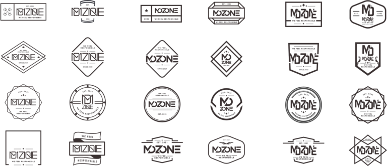
At this stage, after choosing the final logotypes from the employer, we chose the family of letters and appropriate fonts. Finally, the main need was a logo or symbol. The goal was to choose a symbol that evokes the sports aspect, especially martial arts. By using patterns from sports medals and flags and championship belts, animals, forms, and geometric shapes, we finally managed to create several logo examples.
Logo
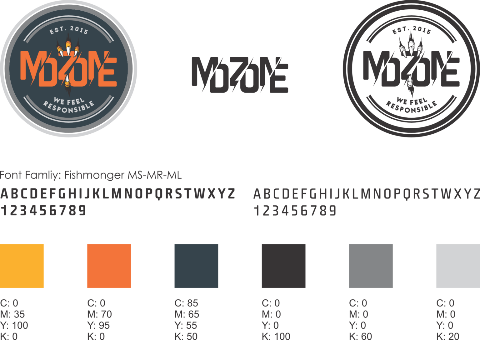
Finally, we arrived at the final design, which is a medal form for the main frame of the logo, inside which are the claws of an eagle, which is a symbol of speed, strength, and sharpness, and which holds the logotype and slogan.
Color palette
Adapting from the first, second, and third place sports medals, i.e. gold, silver, bronze medals, and eagle’s claws and symbol of health, we finalized the color palette of gold, silver, bronze/orange, and green/blue.
